


FOREKNOW. FORESAVE.®
The most trusted partner imaging the unknown
We at Detection Technology work in the business of securing and saving lives. We are a global provider of X-ray detector solutions and services for the most stringent medical, security and industrial applications.
We are known as the most trusted partner imaging the unknown. Our visual identity aims to further strengthen this brand recognition and to support key messaging on us as a reliable partner that nurtures high quality and close co-operation with its customers for enhanced end-user health and safety. In our graphic guidelines, we present basic elements that visually communicate our purpose, way of working, and other features that we want to be associated with us.
In order to allow our brand to be received positively and consistently, follow the guidelines as precisely as possible. If something needs to be enlightened or clarified, do not hesitate to contact our marketing team.
Logo
The company logo should be used in all official external and internal documentation.
Shape and color
Use the logo preferably on white or company gradient background. If it’s unavoidable to place a logo on a multicolored photograph use the version of the logo that best stands out from the background.
Use only DT purple, gradient, black or white.
DT Purple
- PANTONE: 254C
- CMYK: 52/96/0/0
- RGB: 150/22/154
- HTML: #96169A
Please do not rotate or stretch the logo, add drop shadow, embossing, or any background box etc. to the logo.
Space around the logo
Use the margins on the file, and avoid placing any other elements or texts inside this area.
![]()
![]()
![]()
![]()
Graphic mark
Shape and colour
The DT mark, derived from the company logotype, is designed to be used for marketing communication. Use only the brand colors.
Space around the mark
Use the margins on the file, and avoid placing any other elements or texts inside this area.


Choosing the symbol
The company logo and the DT mark are designed to be used in different purposes. The logo should be used in all official external and internal documentation, such as drawings, engineering documents, work instructions etc.
The DT mark should be used in versatile online and print marketing collateral. The mark can be also used, if there is no room for the company logo, for example in product labeling.
Color definitions
Our color scheme consists of three highlight colors, purple, pink and blue, and gradients. The purple should be used as a primary color, and pink and blue as secondary colors in small quantities to lift or add punch to the color scheme. Shades of grey are used for pacing the content. All highlight colors should be used moderately, and overall look should be light and fresh.
Purple, pink and blue are used for highlighting different content to make the subject more readable and easier to remember. For example, when addressing messages on our main three market segments, different accent colors may be used: pink for medical, purple for security and blue for industrial applications.


DT pink
- PANTONE: 807C
- CMYK: 0/82/0/0
- RGB: 255/22/188
- HTML: #FF16BC

DT purple
- PANTONE: 253C
- CMYK: 46/90/0/0
- RGB: 150/22/154
- HTML: #96169A

DT blue
- PANTONE: 2091C
- CMYK: 86/86/0/0
- RGB: 76/20/190
- HTML: #4C14BE

- Pink with shadow

- Purple with shadow

- Blue with shadow

linear-gradient(144deg, rgba(76,20,190,1) 0%, rgba(160,22,162,1) 45%, rgba(255,22,188,1) 100%)

Typography
Marketing and company materials
The Open Sans and Open Sans Bold fonts will be used for all digital and printed marketing materials and other documentation.
The Open Sans font family can be downloaded free from web for internal and external use. Open Sans Bold is used in the first (H1), second (H2) and third (H3) level titles and Open Sans in a body text. Open Sans Light can be used in big and prominent headings in print and online.
Typography example:
H1, Open Sans Bold
H2, Open Sans Bold
H3, Open Sans Bold
Body text, Open Sans Light.

Open Sans Bold
ABCDEFGHIJKLMNOPQRSTUVXYZÅÄÖ
abcdefghijklmnopqrstuvxyzåäö 1234567890
Open Sans
ABCDEFGHIJKLMNOPQRSTUVXYZÅÄÖ
abcdefghijklmnopqrstuvxyzåäö 1234567890
Use the Open Sans font family always when available. Replacement fonts are Arial Bold and Regular.
Images
Our brand imagery works on three levels.
1. Brand images
The brand images of X-ray equipment, application areas, and end-use cases / environment are used to strengthen our brand image as the most trusted partner imaging the unknown, and to highlight our target markets.


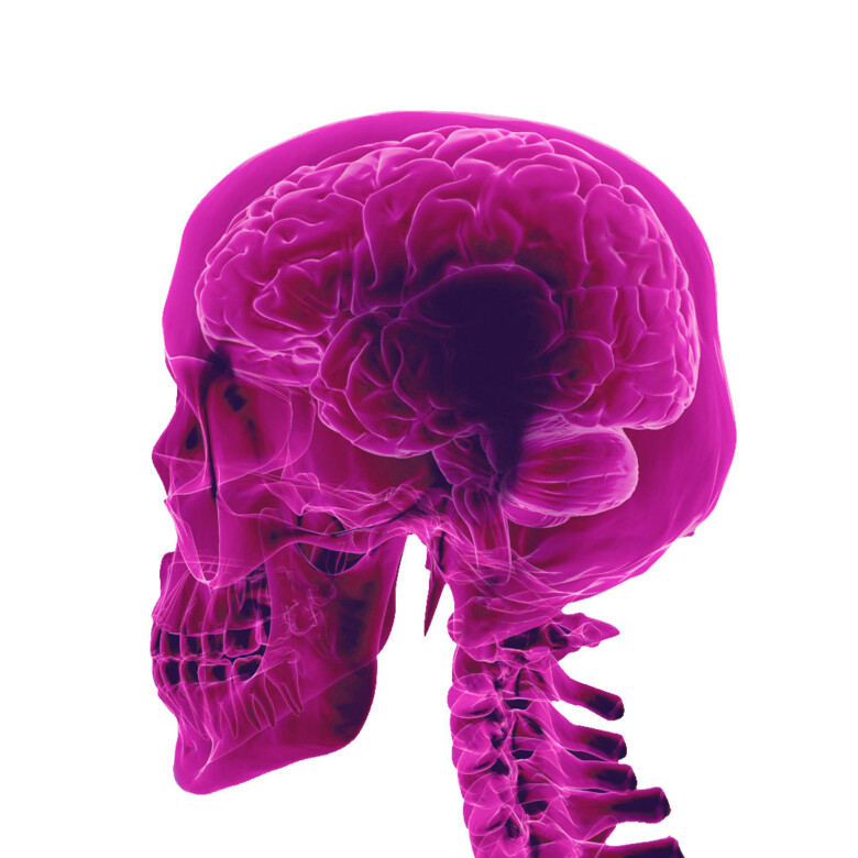
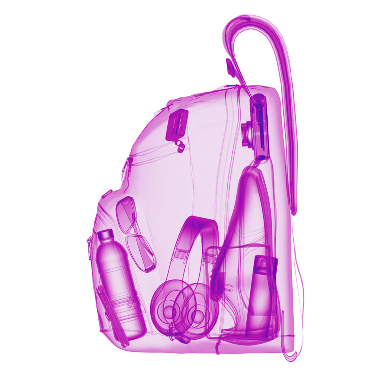
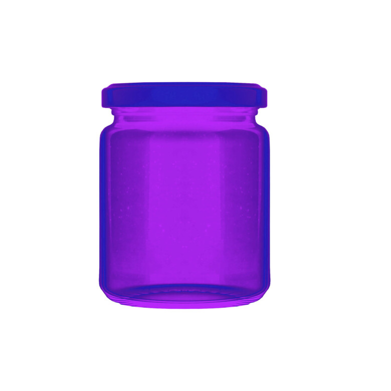
2. Application and X-ray images
Application and X-ray images portray the final outcome of use of our X-ray detector solutions. All images should communicate strongly enhanced customer experience. The message of this level imagery should be about “foreknow”, “foresee”, “save” and “improve quality of live”.
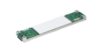
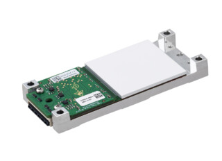
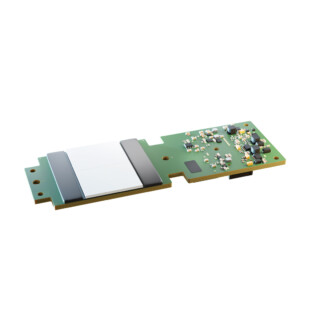
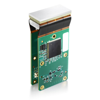
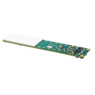
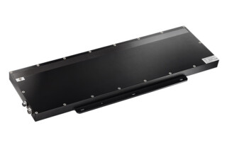
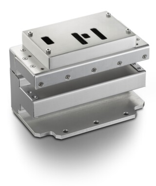
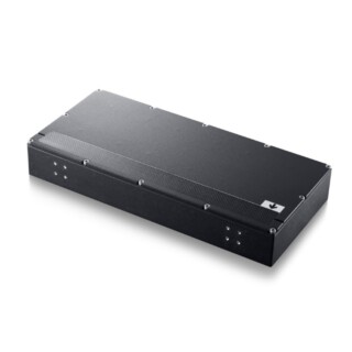
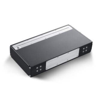
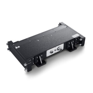
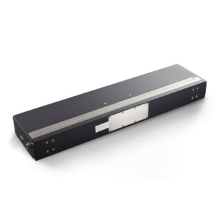
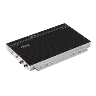
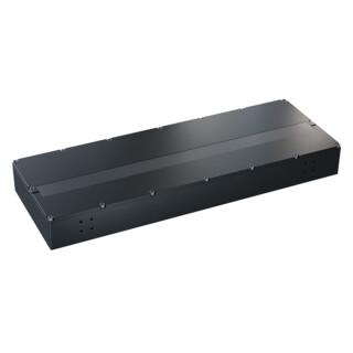
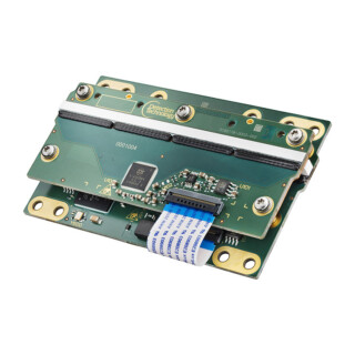
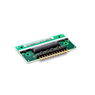
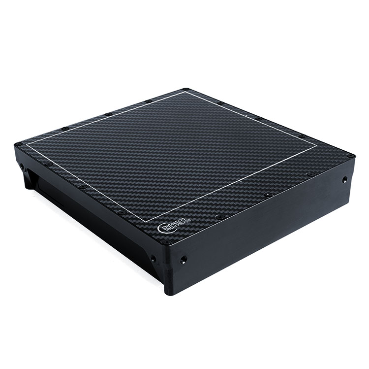
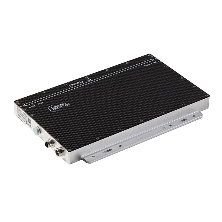
3. DT products
Product photos are used when demonstrating our solutions and communicating specific product features. Photos should be clean, crispy and isolated from the background, and represent high quality in all means.


For more information
Johanna Tarkiainen
Director, Marketing and Communications
+358 40 7287 163
johanna.tarkiainen@nulldeetee.com