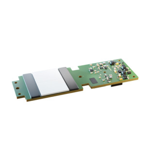
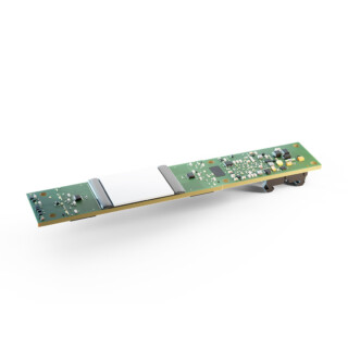
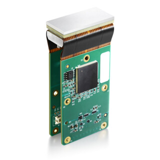
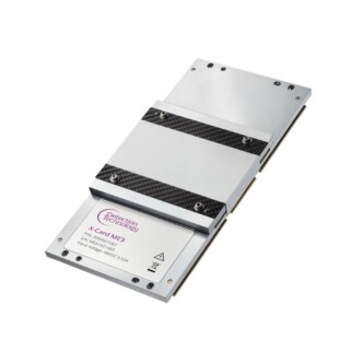
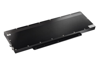
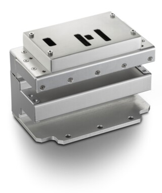
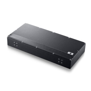
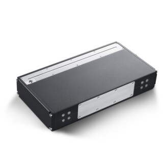
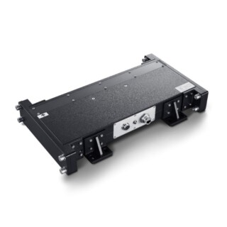
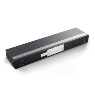
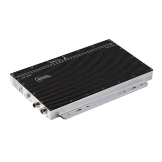
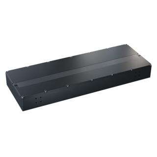
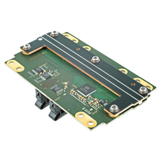
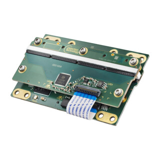
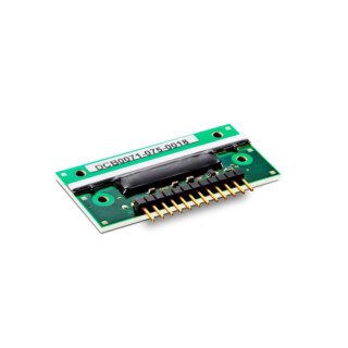
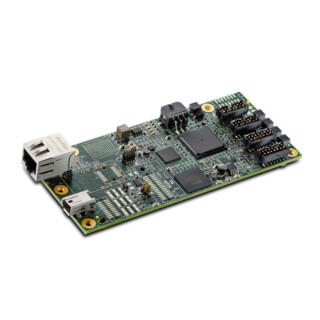
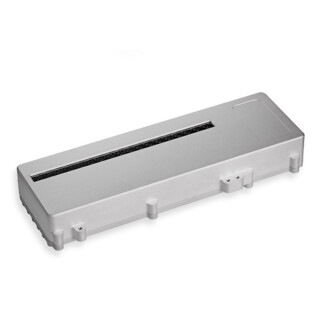
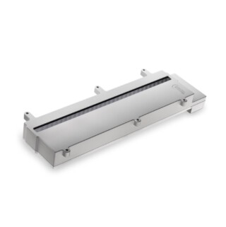
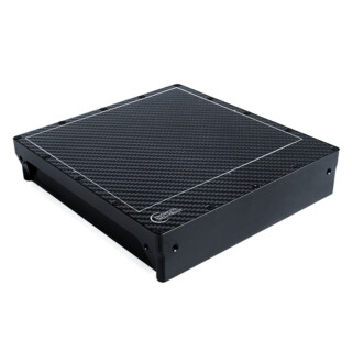
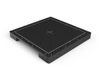
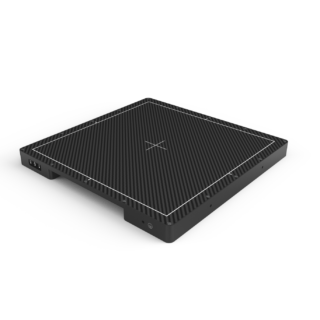
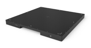
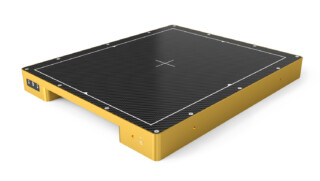
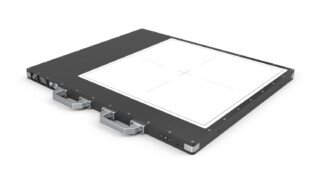
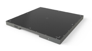
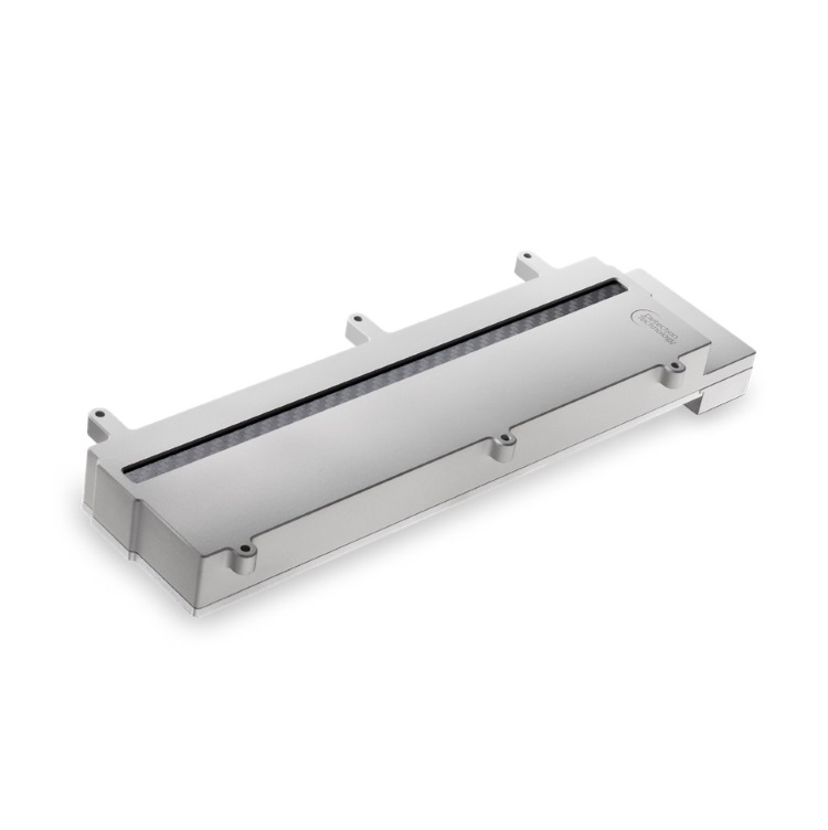
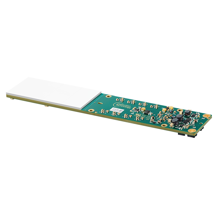
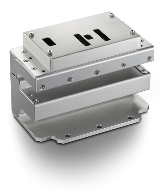
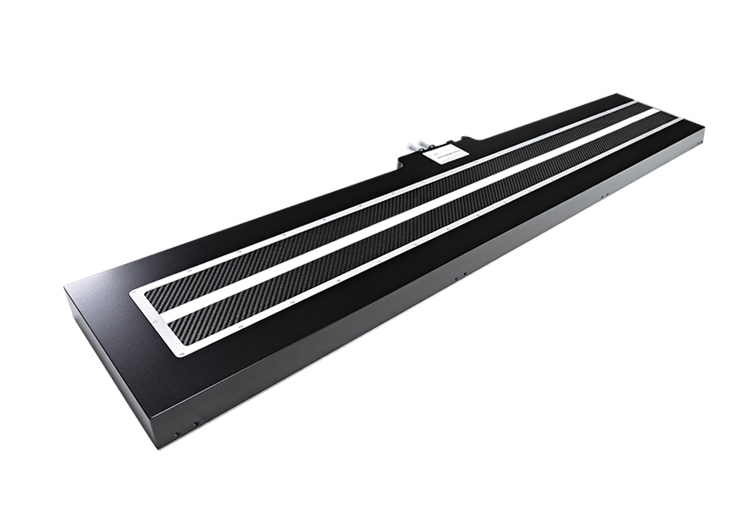
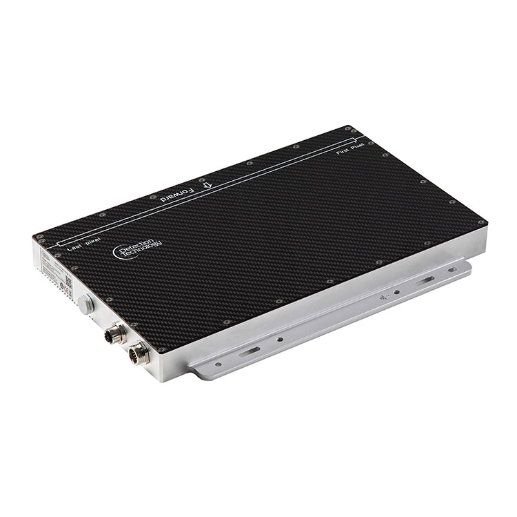
News
New Outlook for Detection Technology
Detection Technology has upgraded their visual image to emphasize what the company stands for. DT is a reliable, agile partner who understands customer needs and expectations and is capable of transferring them into winning solutions.
The basis for the new visual image is the fresh new corporate colour scheme. Colours are selected to highlight the core characteristics of DT. Purple is the foundation of the colour scheme which originates from the reflection of silicon being the core competence area of the company from the beginning in 1992. Cyan translates to friendly and confidential, symbolizing the customer intimacy. Ochre, the colour of safe and reliable, describes DT's line of business as well as what DT's products represent.
A new, clear and modern logo with the slogan - seeing through - tells about the industry Detection Technology is active in. The slogan also communicates DT's persistence, positive attitude, direction and energy to develop better in the future.
The first and most visible implementation of the updated corporate identity is this new website. Detection Technology's new website emphasizes user friendliness; easy navigation, fast response and consistency. DT's main application areas Security, Industrial and Medical Imaging as well as Measurement Applications are found on the landing page making it easy to navigate further.


